
NHS App
NHS App
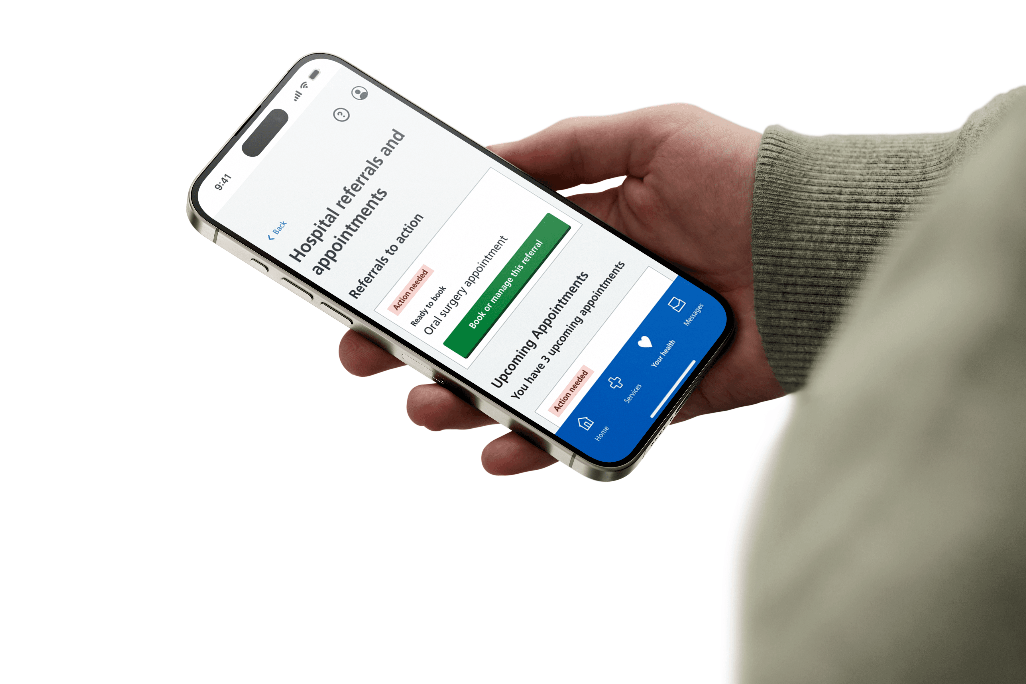
The NHS App serves as a digital gateway to empower patients, improve accessibility to care, and streamline personal healthcare management for 47 million patients across the UK.
The NHS App serves as a digital gateway to empower patients, improve accessibility to care, and streamline personal healthcare management for 47 million patients across the UK.
Project @ IBM iX
Role
Role
User Research
User Research
UX Design
UX Design
Duration
Duration
8 months
8 months
2023 (Jan - Aug)
2023 (Jan - Aug)
Skills
Skills
UX Design
UX Design
User Research
User Research
Tools
Tools
UX Design
UX Design
User Research
User Research
Case Study
Case Study
10 minute read
10 minute read

Designing an accessible appointment management experience for 47 million users.
Designing an accessible appointment management experience for 47 million users.
Designing an accessible appointment management experience for 47 million users.
The Challenge
The Challenge
The Challenge
After a thorough assessment of NHS services across the UK, we learnt that there were a few problems being reported by hospitals across the UK.
After a thorough assessment of NHS services across the UK, we learnt that there were a few problems being reported by hospitals across the UK.
Missed Appointments
Missed Appointments
Users frequently missed their appointments or showed up at the wrong time.
Users frequently missed their appointments or showed up at the wrong time.
Appointment Confusion
Appointment Confusion
Users accidentally rescheduled appointments, leading to confusion and more phone calls to hospitals, increasing the administrative workload of healthcare professionals.
Users accidentally rescheduled appointments, leading to confusion and more phone calls to hospitals, increasing the administrative workload of healthcare professionals.
Accessibility Issues
Accessibility Issues
Visually impaired patients who used screen readers could not understand their appointment details and the structure of the app itself.
Visually impaired patients who used screen readers could not understand their appointment details and the structure of the app itself.
My Process
My Process
My Process
To ensure that our outcomes aligned with real patient needs, I adopted the Double Diamond design framework.
To ensure that our outcomes aligned with real patient needs, I adopted the Double Diamond design framework.

Discover
Define
Develop
Deliver

Discover
Define
Develop
Deliver
Click to see the deliverables at each stage.
Click to see the deliverables at each stage.
The Discovery Stage
The Discovery Stage
The Discovery Stage
Mapping the user's journey
Mapping the user's journey
What is the as-is experience of patients receiving care by using the NHS App?
What is the as-is experience of patients receiving care by using the NHS App?
Key Contributions
Key Contributions
I structured the roadmap by dividing the user journey into stages, providing a clear framework now used in the NHS core programme's project management framework.
I structured the roadmap by dividing the user journey into stages, providing a clear framework now used in the NHS core programme's project management framework.

My Methodology
My Methodology
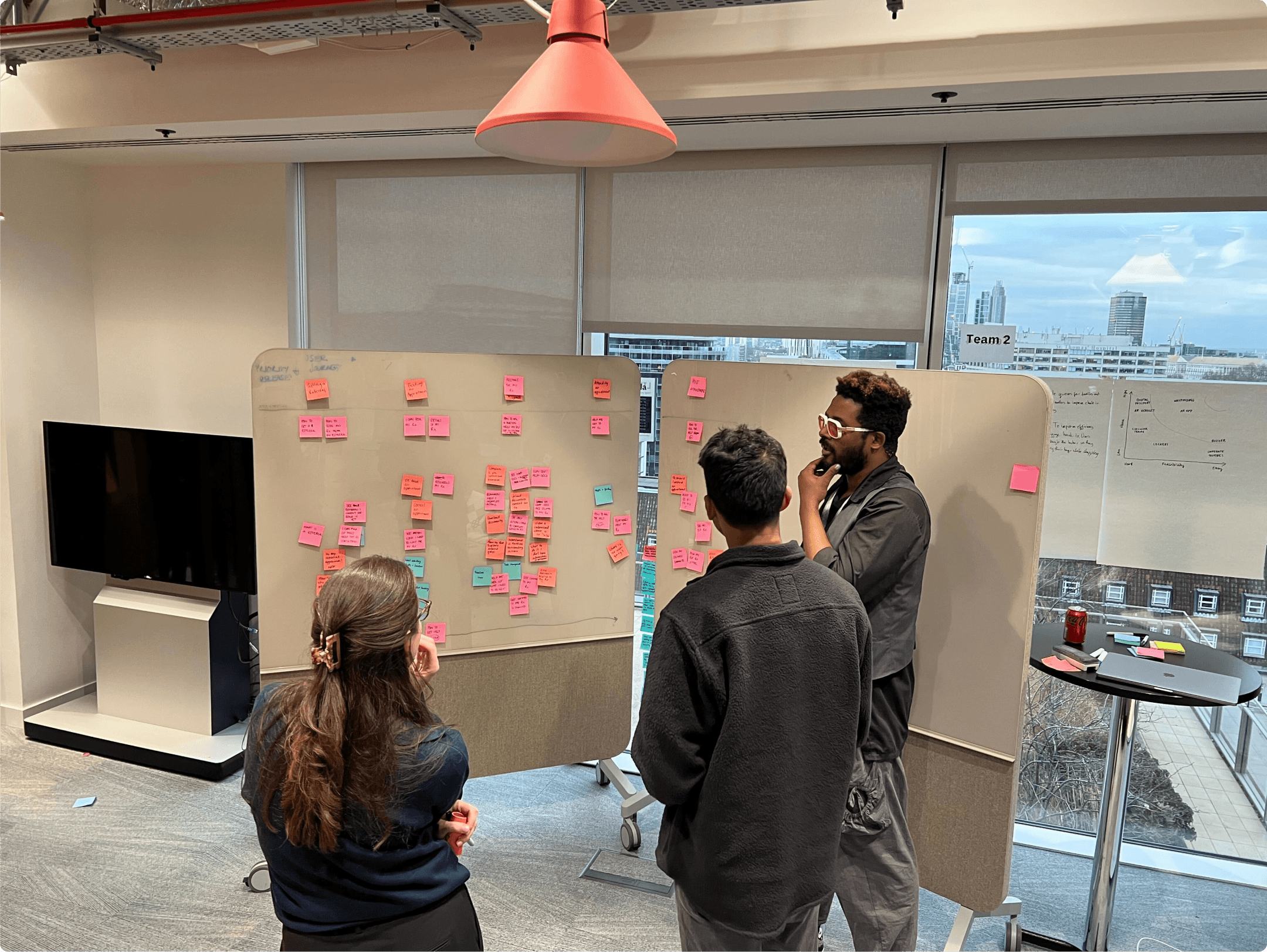
I mapped the user journey to identify key stages and pain points. Insights from NHS reports and user feedback helped segment the journey, highlighting unmet needs and guiding targeted testing to improve usability.
1
1
User Needs Path
User Needs Path
Captured a patient’s needs: from asking for care to receiving it.
Captured a patient’s needs: from asking for care to receiving it.
2
2
Segmented the Journey
Segmented the Journey
Divided the journey into clear, manageable stages.
Divided the journey into clear, manageable stages.
3
3
Identified Unmet Needs
Identified Unmet Needs
Used NHS reports to pinpoint unmet user needs.
Used NHS reports to pinpoint unmet user needs.
4
4
Plan Testing Sessions
Plan Testing Sessions
Design testing sessions to uncover app issues.
Design testing sessions to uncover app issues.

The Pain-Points
Pain Point 3
The page was not accessible enough for people with visual impairments.
Observation
Screen readers repeat information, creating the possibility for visually impaired users to read the appointment information incorrectly.
Specific Issue
Repeated panels crowd the page, weakening the the visual and auditory hierarchy.

The Pain-Points
Pain Point 2
People clicked into appointments by mistake.
Observation
The green button made elderly users think they need to change something about their appointment.
Specific Issue
The green button creates a false sense of urgency, and has a strong visual presence, encouraging the user to click on it.

The Pain-Points
Pain Point 1
Appointment infomration was confusing to read and hard to remember.
Observation
Patients often associate appointments with their doctor, highlighting the need for clearer information.
Specific Issues
Users care more about the appointment date than the order. The date currently has the smallest visual presence on the card.

The Pain-Points
The Screen, As-Is:
A confusing experience.
What does the page aim to achieve?
The appointments page helps patentis see, manage and control their appointments and referrals at a glance.
Method
Through user testing we analyzed and identified points of friction across the user journey. We observed and ldentified 3 different pain points on the appointments page.
The Visual Hierarchy
The Visual Hierarchy
The Visual Hierarchy
01
Identifying user needs
Identifying user needs
What does a patient need to attend their appointment?
What does a patient need to attend their appointment?
From our user research into how patients view, manage and interact with their healthcare, we came up with a list of priorities.
From our user research into how patients view, manage and interact with their healthcare, we came up with a list of priorities.
priority
user needs
high
time
date
location
condition
alert
low
documents attatched
appointment #
last updated
stage of care
medium
doctor name
apt description
appointment type
priority
user needs
high
time
date
location
condition
alert
low
documents attatched
appointment #
last updated
stage of care
medium
doctor name
apt description
appointment type
02
Evaluating Technical Limitations
Evaluating Technical Limitations
The Current Card
The card includes too much irrelevant information, such as appointment numbers and tags, making it hard to find key details like date, time, condition, and location.
The card includes too much irrelevant information, such as appointment numbers and tags, making it hard to find key details like date, time, condition, and location.
Booked appointment {#}
{tag}
{date}
{time}
{Condition}, {location name}
{Call-to-action text}
Data Adjustments:
Removed, Kept, and Added Based on User Needs
Data Adjustments:
Removed, Kept, and Added Based on User Needs
{#}
number generated based on earliest to latest appointment is not needed as cards will be sorted in order
{date}
the day, month and year of the appointment
{time}
the time of day of the appointment
{condition}
the name of the condition
{hospital}
the name of the hospital
{doctor name}
user research found that clinician names are used as identifiers for appointments
03
Design and Iteration
Design and Iteration
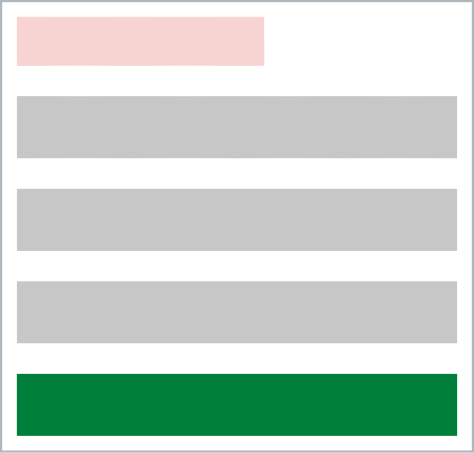
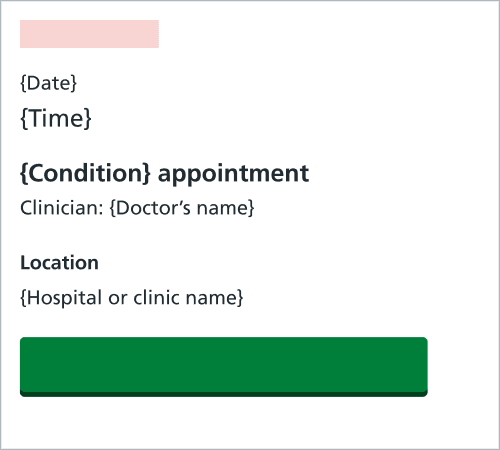
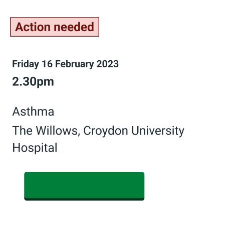
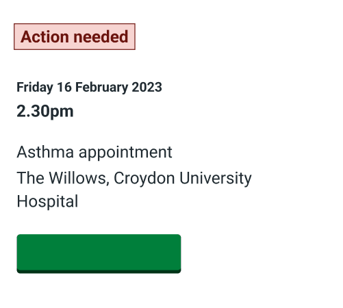
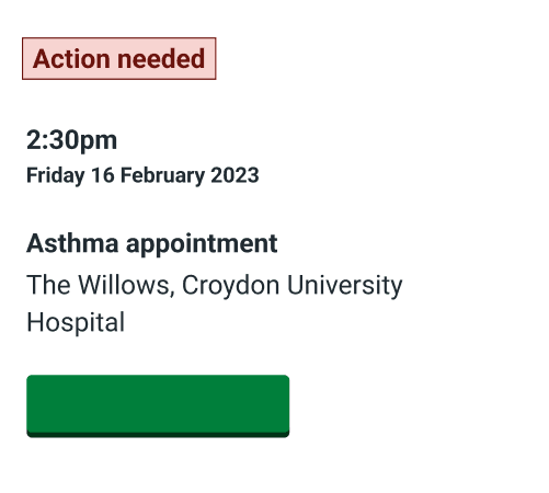
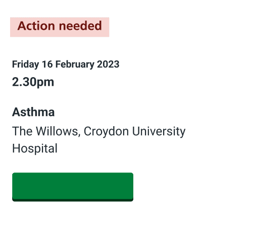
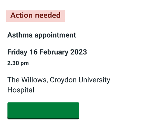
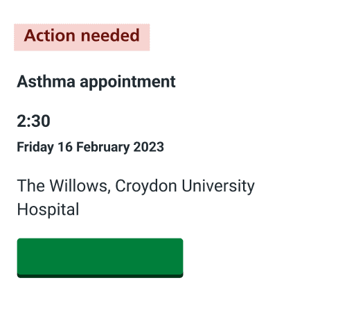
Iteration: Designing the card for greater clarity.
Experimenting with data display to improve clarity. Focused on field placement, adding contextual cues, and clear headings, while minimizing clutter and ensuring content accuracy through thoughtful wording choices.
Iteration: Designing the card for greater clarity.
Experimenting with data display to improve clarity. Focused on field placement, adding contextual cues, and clear headings, while minimizing clutter and ensuring content accuracy through thoughtful wording choices.
Iteration: Designing the card for greater clarity.
Experimenting with data display to improve clarity. Focused on field placement, adding contextual cues, and clear headings, while minimizing clutter and ensuring content accuracy through thoughtful wording choices.
Iteration: Designing the card for greater clarity.
Experimenting with data display to improve clarity. Focused on field placement, adding contextual cues, and clear headings, while minimizing clutter and ensuring content accuracy through thoughtful wording choices.

Iteration: Designing the card for greater clarity.
Experimenting with data display to improve clarity. Focused on field placement, adding contextual cues, and clear headings, while minimizing clutter and ensuring content accuracy through thoughtful wording choices.
Iteration: Designing the card for greater clarity.
Experimenting with data display to improve clarity. Focused on field placement, adding contextual cues, and clear headings, while minimizing clutter and ensuring content accuracy through thoughtful wording choices.

Iteration: Designing the card for greater clarity.
Experimenting with data display to improve clarity. Focused on field placement, adding contextual cues, and clear headings, while minimizing clutter and ensuring content accuracy through thoughtful wording choices.
Iteration: Designing the card for greater clarity.
Experimenting with data display to improve clarity. Focused on field placement, adding contextual cues, and clear headings, while minimizing clutter and ensuring content accuracy through thoughtful wording choices.

Iteration: Designing the card for greater clarity.
Experimenting with data display to improve clarity. Focused on field placement, adding contextual cues, and clear headings, while minimizing clutter and ensuring content accuracy through thoughtful wording choices.
Iteration: Designing the card for greater clarity.
Experimenting with data display to improve clarity. Focused on field placement, adding contextual cues, and clear headings, while minimizing clutter and ensuring content accuracy through thoughtful wording choices.

Iteration: Designing the card for greater clarity.
Experimenting with data display to improve clarity. Focused on field placement, adding contextual cues, and clear headings, while minimizing clutter and ensuring content accuracy through thoughtful wording choices.

Iteration: Designing the card for greater clarity.
Experimenting with data display to improve clarity. Focused on field placement, adding contextual cues, and clear headings, while minimizing clutter and ensuring content accuracy through thoughtful wording choices.

Iteration: Designing the card for greater clarity.
Experimenting with data display to improve clarity. Focused on field placement, adding contextual cues, and clear headings, while minimizing clutter and ensuring content accuracy through thoughtful wording choices.
Iteration: Designing the card for greater clarity.
Experimenting with data display to improve clarity. Focused on field placement, adding contextual cues, and clear headings, while minimizing clutter and ensuring content accuracy through thoughtful wording choices.

Iteration: Designing the card for greater clarity.
Experimenting with data display to improve clarity. Focused on field placement, adding contextual cues, and clear headings, while minimizing clutter and ensuring content accuracy through thoughtful wording choices.
Iteration: Designing the card for greater clarity.
Experimenting with data display to improve clarity. Focused on field placement, adding contextual cues, and clear headings, while minimizing clutter and ensuring content accuracy through thoughtful wording choices.

Iteration: Designing the card for greater clarity.
Experimenting with data display to improve clarity. Focused on field placement, adding contextual cues, and clear headings, while minimizing clutter and ensuring content accuracy through thoughtful wording choices.

Iteration: Designing the card for greater clarity.
Experimenting with data display to improve clarity. Focused on field placement, adding contextual cues, and clear headings, while minimizing clutter and ensuring content accuracy through thoughtful wording choices.

Iteration: Designing the card for greater clarity.
Experimenting with data display to improve clarity. Focused on field placement, adding contextual cues, and clear headings, while minimizing clutter and ensuring content accuracy through thoughtful wording choices.
Iteration: Designing the card for greater clarity.
Experimenting with data display to improve clarity. Focused on field placement, adding contextual cues, and clear headings, while minimizing clutter and ensuring content accuracy through thoughtful wording choices.

Designing the Visual Hierarchy
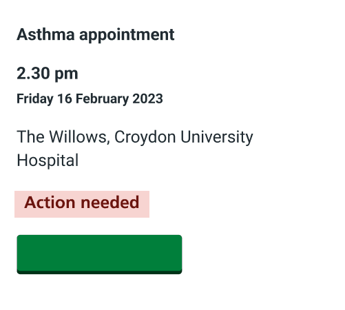
I organized the API data to prioritize key details like alerts, date, time, and condition. Critical information is placed at the top for easy access, while less urgent details appear lower, improving clarity and user experience.
{Alert ON/OFF}
{Time}
{Date}
{Condition}
{Doctor’s name}
{Hospital}
Friday 16 February 2023
2:30pm
Friday 16 February 2023
2:30pm
Asthma appointment
Clinician: Dr Rubina Lander
Location
The Willows, Croydon University Hospital
View or manage this appointment
Designing the Visual Hierarchy
I organized the API data to prioritize key details like alerts, date, time, and condition. Critical information is placed at the top for easy access, while less urgent details appear lower, improving clarity and user experience.
{Alert ON/OFF}
{Time}
{Date}
{Condition}
{Doctor’s name}
{Hospital}
{Hospital}
Friday 16 February 2023
2:30pm
Friday 16 February 2023
2:30pm
Asthma appointment
Clinician: Dr Rubina Lander
Location
The Willows, Croydon University Hospital
View or manage this appointment
04
A New Visual Hierarchy
A New Visual Hierarchy
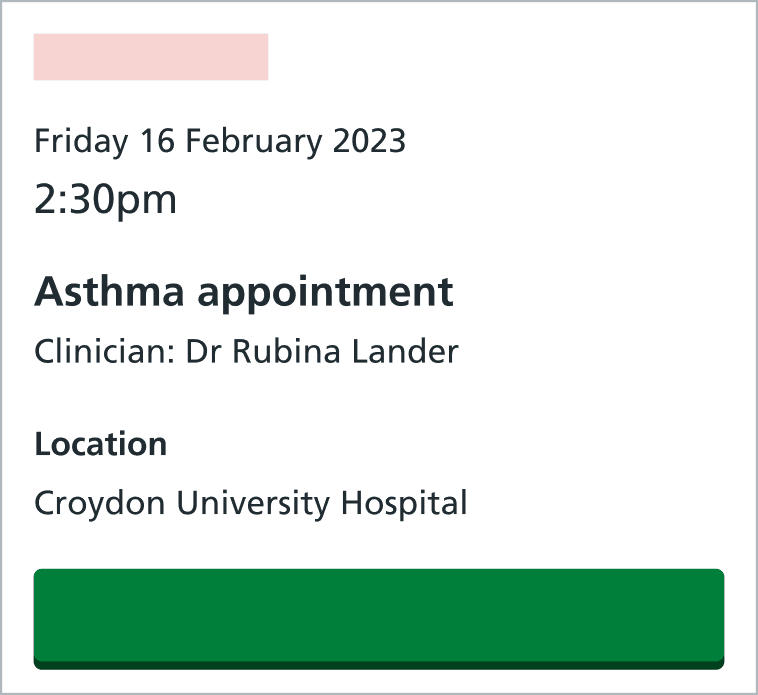
Through iteration we designed an appointment card that provides the needed appointment information in a clear and accessible manner.
Through iteration we designed an appointment card that provides the needed appointment information in a clear and accessible manner.
Date & Time
Date & Time
Time and date are frequently checked, so they're placed at the top for quick access.
Time and date are frequently checked, so they're placed at the top for quick access.
Condition & Clinician
Condition & Clinician
Patients identify appointments by 'Condition' and 'Clinician,' so they're grouped and emphasized with font size and weight, including 'appointment' after the condition.
Patients identify appointments by 'Condition' and 'Clinician,' so they're grouped and emphasized with font size and weight, including 'appointment' after the condition.
Location
Location
Location is key but often unchanged. A hard-coded heading ensures clarity, even with incomplete or incorrect names.
Location is key but often unchanged. A hard-coded heading ensures clarity, even with incomplete or incorrect names.


The Green Button
The Green Button
The Green Button
01
02
The Problem
The Problem
1
1
One button for every case
One button for every case
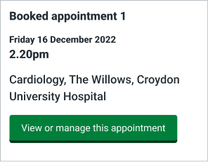
There is only one kind of button used for every appointment card. Bright green, and visually striking on the screen.
There is only one kind of button used for every appointment card. Bright green, and visually striking on the screen.
2
2
Where does the button lead to?
Where does the button lead to?
Through this button, the user can access more information of their appointment, manage it or complete tasks.
Through this button, the user can access more information of their appointment, manage it or complete tasks.


3
3
Creating a false sense of urgency
Creating a false sense of urgency
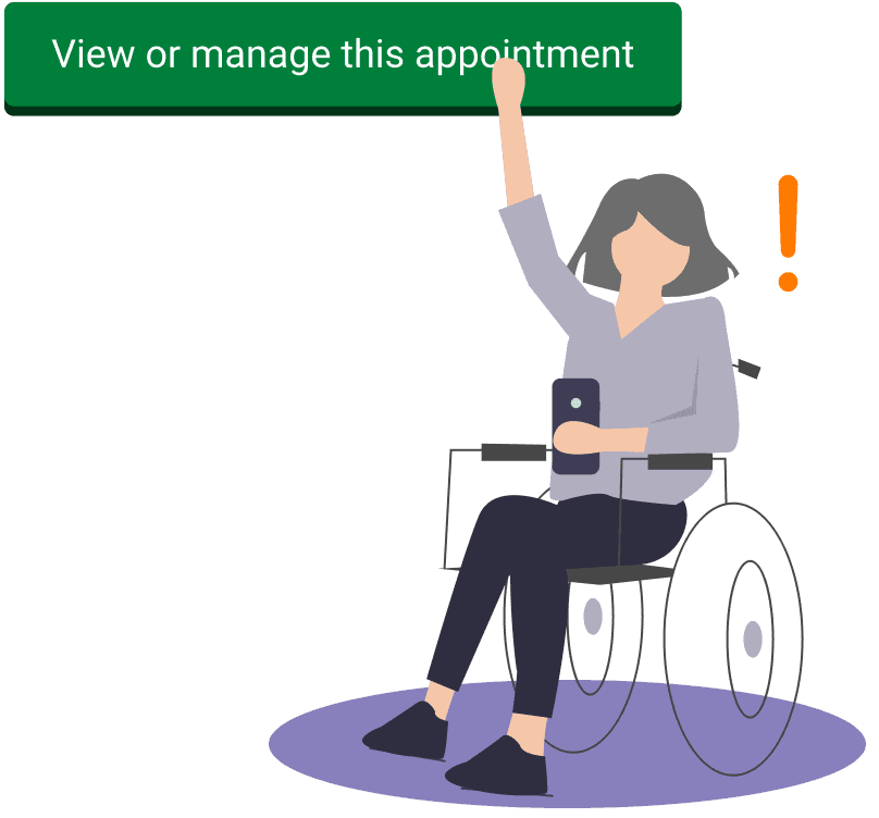
The green button conveyed a message of urgency. In response, many patients, especially the elderly felt compelled to cancel, reschedule or call-in.
The green button conveyed a message of urgency. In response, many patients, especially the elderly felt compelled to cancel, reschedule or call-in.
02
What is the button supposed to achieve
What is the button supposed to achieve
Through iteration we designed an appointment card that provides the needed appointment information in a clear and accessible manner.
Through iteration we designed an appointment card that provides the needed appointment information in a clear and accessible manner.
View additional information
View additional information
Contacts, Apt specifics, Knowing more about your condition, map/directions
Contacts, Apt specifics, Knowing more about your condition, map/directions
Change appointment timing
Change appointment timing
Rescheduling, cancellation
Rescheduling, cancellation
Complete an action
Complete an action
Complete, View outstanding
Complete, View outstanding
03
Influencing User Perception
Influencing User Perception
Separate the functions into 2 likely situations:
Situation 1
Situation 1
View additional information
View additional information
Change appointment timing
Change appointment timing
Contacts, Apt specifics, Knowing more about your condition, map/directions
Contacts, Apt specifics, Knowing more about your condition, map/directions
Rescheduling, cancellation
Rescheduling, cancellation
Situation 2
Situation 2
Situation 1
Situation 1
Situation 1
Complete an action
Complete an action
Complete, View outstanding actions
Complete, View outstanding actions
The idea:
Two distinct buttons.
Two distinct buttons.
To influence user perception, we designed two separate buttons for each case.
To influence user perception, we designed two separate buttons for each case.
Situation 1
Situation 1
Action needed.
Action needed.
Button 1
Situation 2
Situation 2
No Action needed.
No Action needed.
Button 2
04
The Result:
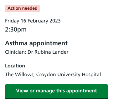
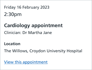
Two Types of Cards.
With Green Button
With Green Button
Indicates an action required.
Indicates an action required.
With Blue Link Button
With Blue Link Button
Indicates no action is needed.
Indicates no action is needed.
Feature Delivery Overview:
When the green button is present, it signals the card requires user interaction.
When the blue link button is present, it indicates no action is needed.
A clear logic defines when each type of button appears, based on user needs and actions.
Optimizing for Accesibility
Optimizing for Accesibility
01
The Problem:
The Problem:
There were too many distracting elements on the screen.
There were too many distracting elements on the screen.
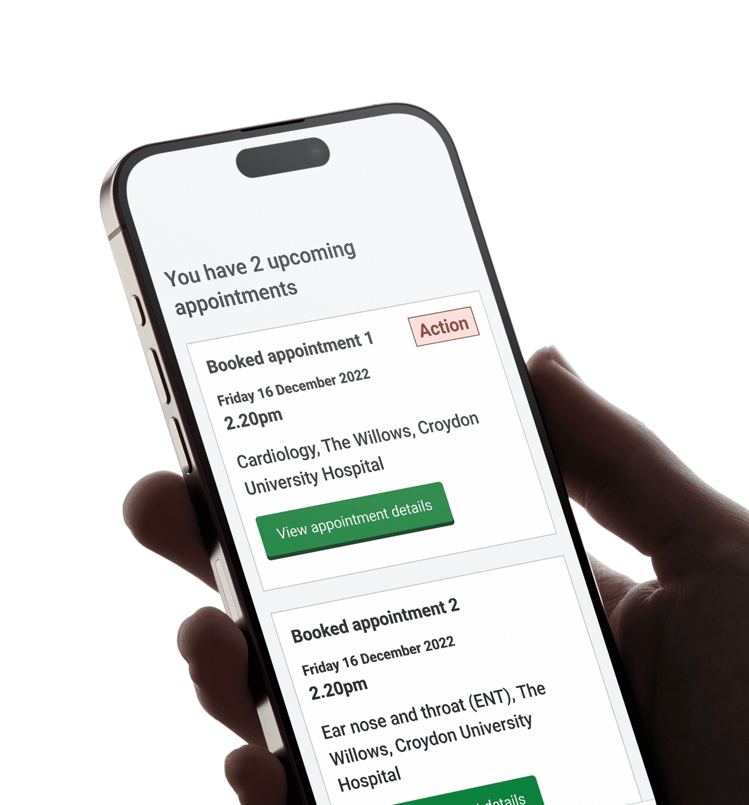
Screen readers were skipping the action button and reading the tag after the appointment, creating confusion about what action to take.
Screen readers were skipping the action button and reading the tag after the appointment, creating confusion about what action to take.
Visually impaired users struggled to understand when they needed to take action for their appointments.
Visually impaired users struggled to understand when they needed to take action for their appointments.


02
Screen Reader Confusion
A common issue occurs when the action tag is read at the end of one appointment summary, making it sound like it belongs to the next appointment, causing confusion for the user.


Booked Appointment 1
Friday 16 December 2022
2:20 PM
Cardiology, The Willows, Croydon University Hospital
View Appointment Details
Action
Booked Appointment 2
Friday 16 December 2022
2:20 PM
ENT, The Willows, Croydon University Hospital
View Appointment Details
Booked Appointment 1
Friday 16 December 2022
2:20 PM
Cardiology, The Willows, Croydon University Hospital
View Appointment Details
Action
Booked Appointment 2
Friday 16 December 2022
2:20 PM
ENT, The Willows, Croydon University Hospital
View Appointment Details


03
Solution
Solution
Accessibility > space optimization.
Accessibility > space optimization.
Moved the action tag to the left (Figure 6.4).
Created a hierarchy that supports screen reading.
Helping the screen reader through vertical alignment of all readable content.
Removed repeated content on the screen (Figure 6.5).
Considering the natural reading path.
Prioritizing better copywriting for headings.
6.4 Changes to card
HOVER
PRESS & HOLD
6.5 Screen Reader Flow
HOVER
PRESS & HOLD
Project Retrospective
Project Retrospective
Creating a real impact.
Serving 47 million patients
Serving 47 million patients
across the United Kingdom.
across the United Kingdom.
40 million appointments
40 million appointments
to be managed on the app.
to be managed on the app.
Delivering 87% of care
Delivering 87% of care
in England.
in England.
In the first 10 months from deployment:
25%
more patients completed required tasks than before.
more patients completed required tasks than before.
25.64%
Before Redesign
Before Redesign
After Redesign
After Redesign
50.11% patients completed tasks pre-redesign
50.11% patients completed tasks pre-redesign
75.75% patients complete tasks post-redesign
75.75% patients complete tasks post-redesign
A project full of learning opportunities.
A project full of learning opportunities.
Embracing Constraints to find Opportunities
Embracing Constraints to find Opportunities
I learned how to use limitations to spark creative solutions, balancing user needs with technical challenges.
I learned how to use limitations to spark creative solutions, balancing user needs with technical challenges.
Harnessing the Power of User Research
Harnessing the Power of User Research
Users accidentally rescheduled appointments, leading to confusion and more phone calls to hospitals, increasing the administrative workload of healthcare professionals.
Users accidentally rescheduled appointments, leading to confusion and more phone calls to hospitals, increasing the administrative workload of healthcare professionals.
Accessibility as a Guiding Principle
Accessibility as a Guiding Principle
This project showed me that accessibility has to be built in from the start, making sure everyone can use the design effortlessly.
This project showed me that accessibility has to be built in from the start, making sure everyone can use the design effortlessly.
